One detail I should have covered and, and one that is very important in marketing books, is viewing the covers in the sizes they will appear on online sales channels. The art may look good on the book, but if it doesn’t grab the shopper at pixel sizes 56 x 86, 85 x 115, and 190 x 260. The middle size is particularly important as it is displayed it the list of hits.
Does that change your vote?


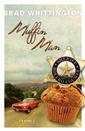


Ok. As long as the muffin is smaller and the title is not so curly, I go with the first one.
Aesthetically, I like both, but from a slightly more practical side, I see problems with both.
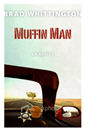
Somewhere between the age of my eyes and the fact that laptops aren't always as crisp as desktop monitors, the colors/nuances of the windshield frame and dashboard in B get totally lost – so much so that I almost can't tell what they are. And that's with the large version posted Friday. The problem is exacerbated greatly when the image gets smaller. The only cue as to what's going on is the side-view mirror, and even that becomes less obvious in the smaller images.
And the words "(A NOVEL)" on choice B are barely discernible in any of today's sizes — not enough contrast.
OTOH, the title font on choice A becomes illegible fast when you shrink it down. If I didn't know what it was already, I'd assume that it was "Muffim Min" at 85×115, and I wouldn't even bother to try to guess at 56×86.
That red mustang really catches ones eye
The votes are coming down for A, but the title font is an issue, along with a few other minor things. However, for two first drafts of a cover concept, I have to say I think they're outstanding. I'm very excited to see this novel project coming together and approaching the finish line!
Oh yeah, they rock in general! I've just become more sensitive to contrast and other issues of legibility as (1) I've become older and (2) I've taken on role as primary projectionist at my church. If I can't read the PPT screen during my pastor's sermon, then maybe the guy sitting closer, but 20 years older than me, can't either.
and (3) as I try to get used to these #$!@ bifocals. 😉
I still like A