
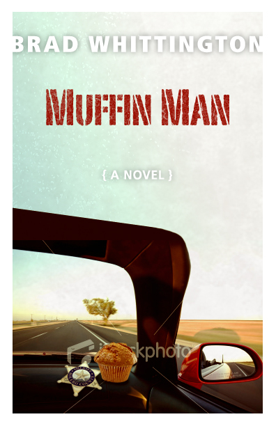
The lovely and talented Amanda Cobb is creating the cover art for Muffin Man. By looking at these two preliminary designs, you can see why I chose her for this project. Drop a line in the comments to tell me which one you like best, A (top) or B (bottom). However, I must warn you that The Woman has the final word.
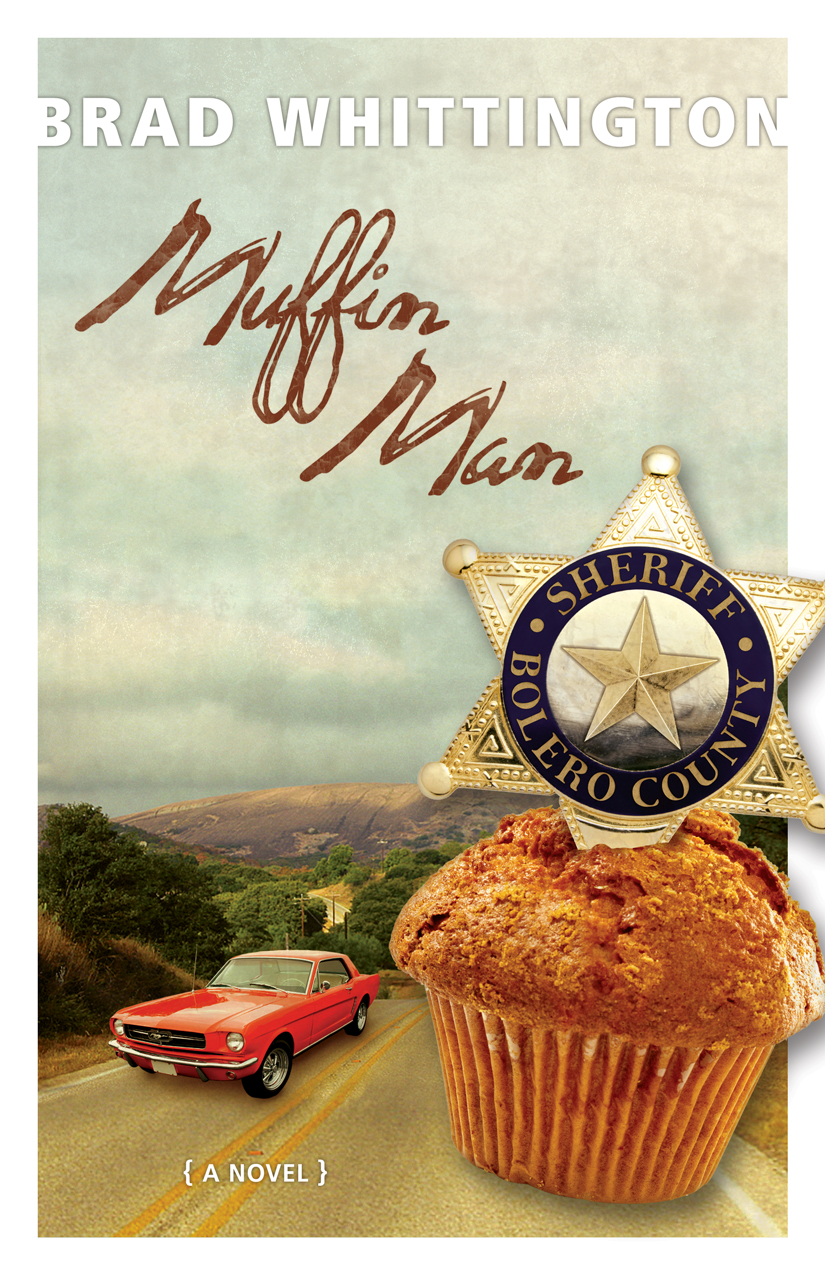
Choice A.
But yes, listen to The Woman.
B.
The top one. I can't figure out what's happening with the bottom one.
2nd one for sure. -Heidi
I like the hill country in the first with the car and muffin and sheriff badge in the 2nd one…combine them
Love the concept of B, but: 1) in thumbnail sizes the details of the windshield frame/dashboard with the muffin/badge is lost and the viewer will be confused; 2) it isn't clear that this car is a Mustang. To fit with the story, a view through John's truck window, muffin and badge on the dashboard, with the Mustang visible head-on would visually capture the story better.
I agree with Tosh- B is the better concept and there is room for tweaking- the muffin in B needs to be resized or something-it looks fake-ish. Also, a view through the window is an excellent idea-though I rather like seeing the badge, brown bag and muffin(+crumbs?)spilled out on seat as opposed to dash…regardless, good work Ms. Cobb!…definitely outshines that ARC the author made! (oh wait, can he see this?)